Branding
Download branding assets with guidelines for using the Method branding correctly.
Logo Guidelines
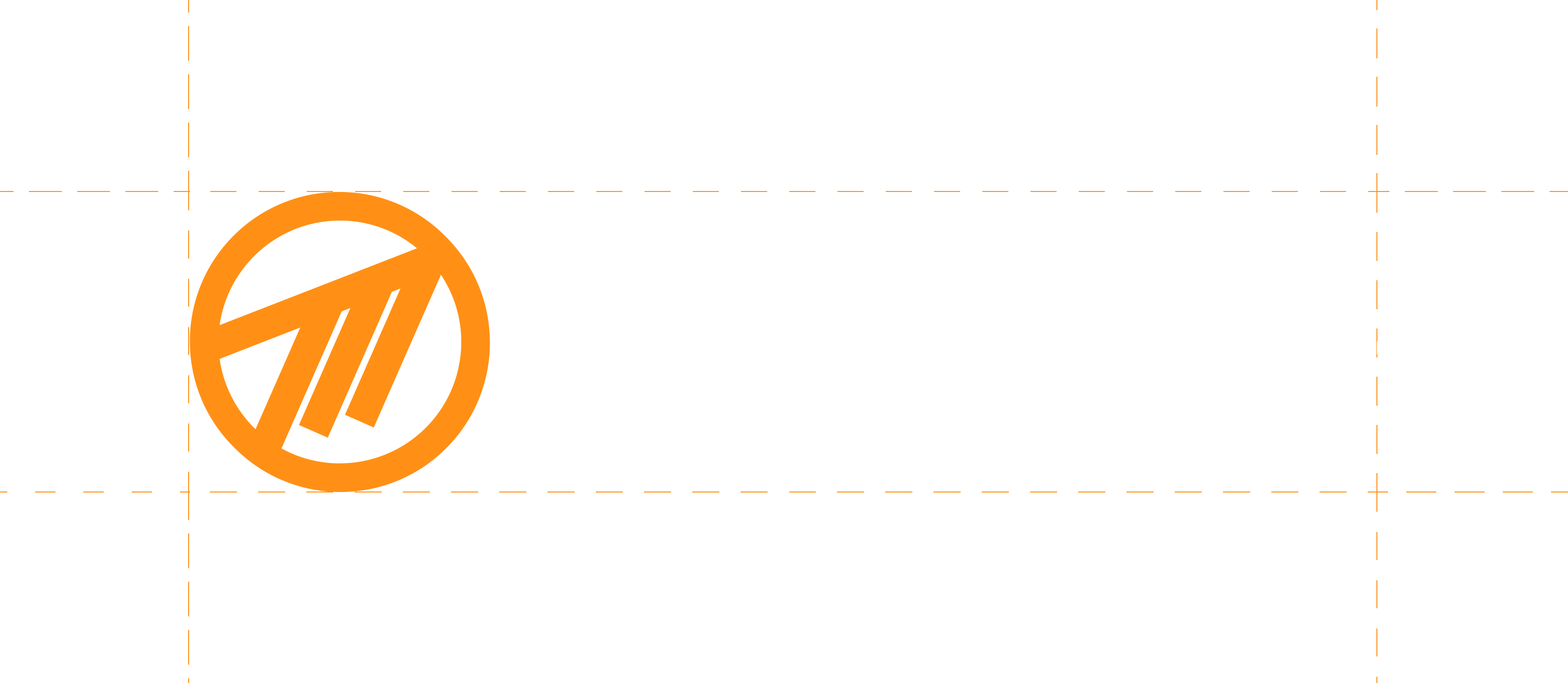
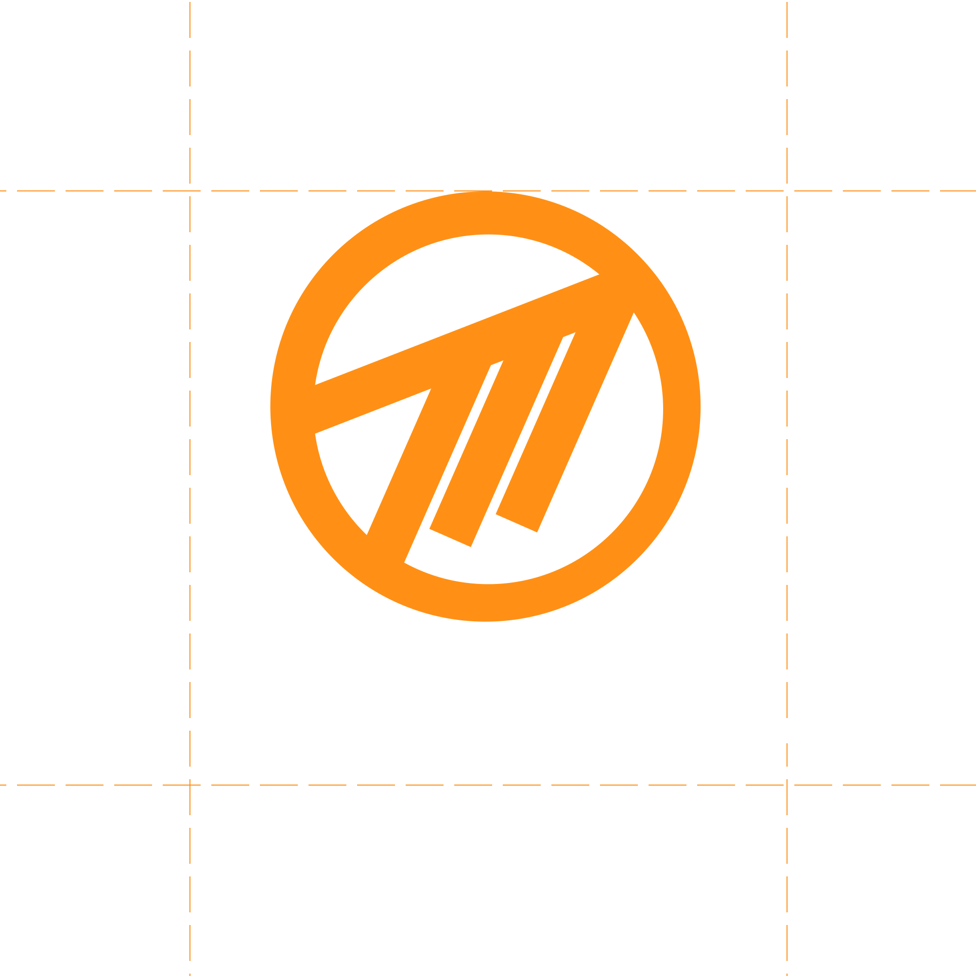
Logo Spacing


Logo Guidelines
Bad
- Don't add drop shadows to the logo
- Don't change the typeface
- Don't place the logo at an angle
- Don't split or change the appearance of the logo
- Don't stretch or distort the logo
- Don't change the colours of the logo
Good
- Use one of the logos on this page or in the Media Kit
- Ensure the logo has correct spacing from other elements
- Make sure the logo isn't too small
- Prioritise the use of the orange logo
Brand Colours
#ff9117
#ffffff
#242527
#1b1b1b
#000000
Full Media Kit Download
The Media Kit contains the official Method logo in a variety of layouts/formats.
Download Media Kit


